A Guide: 7 Ways to Structure Your Presentation
Building a great presentation is a must these days. Check out these tips to help you understand how to create a more structured presentation


Disclaimer: All the presentation slides that I've shared in this post is self-owned and based on an assignment by one of the online school in Indonesia. It does not represent any companies that might have been mentioned.
Presentation nowadays has become more important than ever. With meetings going online due to social restrictions, presentation is one of the most effective way to communicate to your stakeholders. Especially if you are doing something like weekly, biweekly, or monthly reporting.
Creating a presentation is much more than writing your findings on top of a blank page, there is actually a way to make your presentation more appealing and eye-catching that it will leave everyone in the room speechless.
With that in mind, I would like to share how you can structure your presentation so you can present like a boss in front of your boss.
Start with the end in the beginning
When you're presenting a report that is full of numbers and hard data, it's easy to leave your audience astray. They will often feel lost in translation and don't know what you're talking about on the get go.
What you can do to eliminate this is by using an executive summary slide at the very beginning of your presentation. The following is an example of an executive summary.
With executive summary, you are setting the stage to your audience of what to expect during the course of your presentation. It's a great way to structure your presentation since it summarises the whole presentation in one single slide that everyone can understand.
To make your executive summary more appealing, you can utilize the use of graphs, charts, and the right sets of colors within the fonts / slide background.
Use Headlines Instead of Labels
This technique is highly adapted in big consultant agencies. What I meant by labels is the title of each slide. What we usually do in our presentation is to write "what are we going to talk about" in each slide to help our audience to know what to expect in each slide.
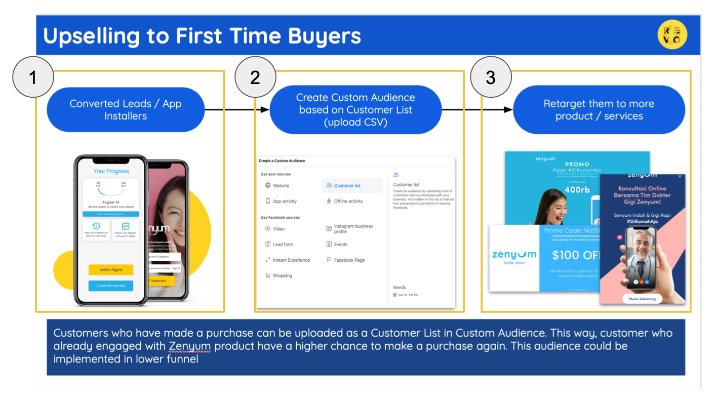
That said, there is a better and quicker way to make your audience to understand your message on the get go. It's by replacing your conventional label or titles, into headlines. The key difference between the two, is the latter contains "the summary of what you want to say on each slides" . The following image is the example of how you can change your labels into headlines.
Pay attention that by changing your labels into headlines, it will help your audience to better understand the main point that you want to highlight on each slides.
Support Headlines with Evidence
It is important for each headlines to be supported by data / statement to strengthen your findings.
The point is quite simple, what you wrote as a headline has to be in coherence with what you will write in the main slides. Simply put, you have to write the data that supports your headline statement.
Some pro tip: write key findings and insights on each slide to summarise your findings, it can help you to deliver your point during your presentation.
One Message per Slide
Keep everything simple. In some cases, we have so many data / findings that we want to share to our audience / stakeholders. That said, you need to prioritize the data that you want to share and ask yourself "which of these data is more important" to be shown.
You audience might disagree with what you're currently showing and that's okay, ask for their feedback and expectations and iterate for your next meeting. After all, creating a presentation is not a one-off task, it's a continuous process.
Logical Information Hierarchy
This might sound simple, but people easily get lost when they want to structure their presentation. What Logical information Hierarchy means is simply how structured your presentation layout is.
This can be achieved by understanding how humans usually process information in a logical order. Most people prefer left to right (like how we read things), some research shows people also prefer to read in a "Z like pattern" whereby people will start scanning information from the top left, top right, bottom left, and bottom right - like a letter z.
With this in mind, it's important to incorporate this method when you are structuring your presentation. This can go a long way to help your audience understand your message
Leverage the Use of Clear Diagrams
Not a single of us is a mind reader, that said it is important for us to find a way to communicate your thought process to your audience.
If you are able to do this, your audience will understand the reason of the outcome that you shared to them. Additionally, it will eliminate any question such as : "Why has this become your approach?" , "Could you explain why you decided to go with this approach?"
Using clear and simple diagrams will also train you have a more structured communication during your presentation.
Use Icons and Images
Needless to say, these tip is important since it will make your presentation more appealing. The use of the right icon and images can help your audience to understand your point quicker without using too much words.
It's like what people said these days: "A picture speaks a thousand words" the case is also true when you are making a presentation. Picture and icons can help your audience to easily visualize your idea or message.